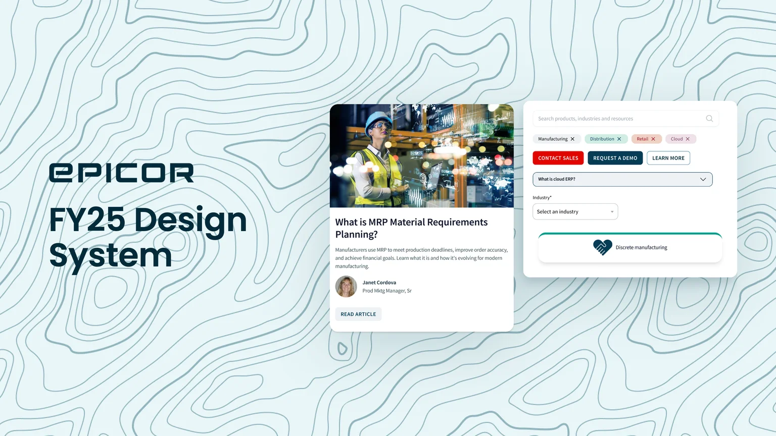
Epicor FY25 Design System
Token architecture for a global brand, from flat styles to a three-tier system.
- Role
- UX/UI Designer. I owned the token architecture, component quality, naming and documentation, in a team of two designers.
- Outcome
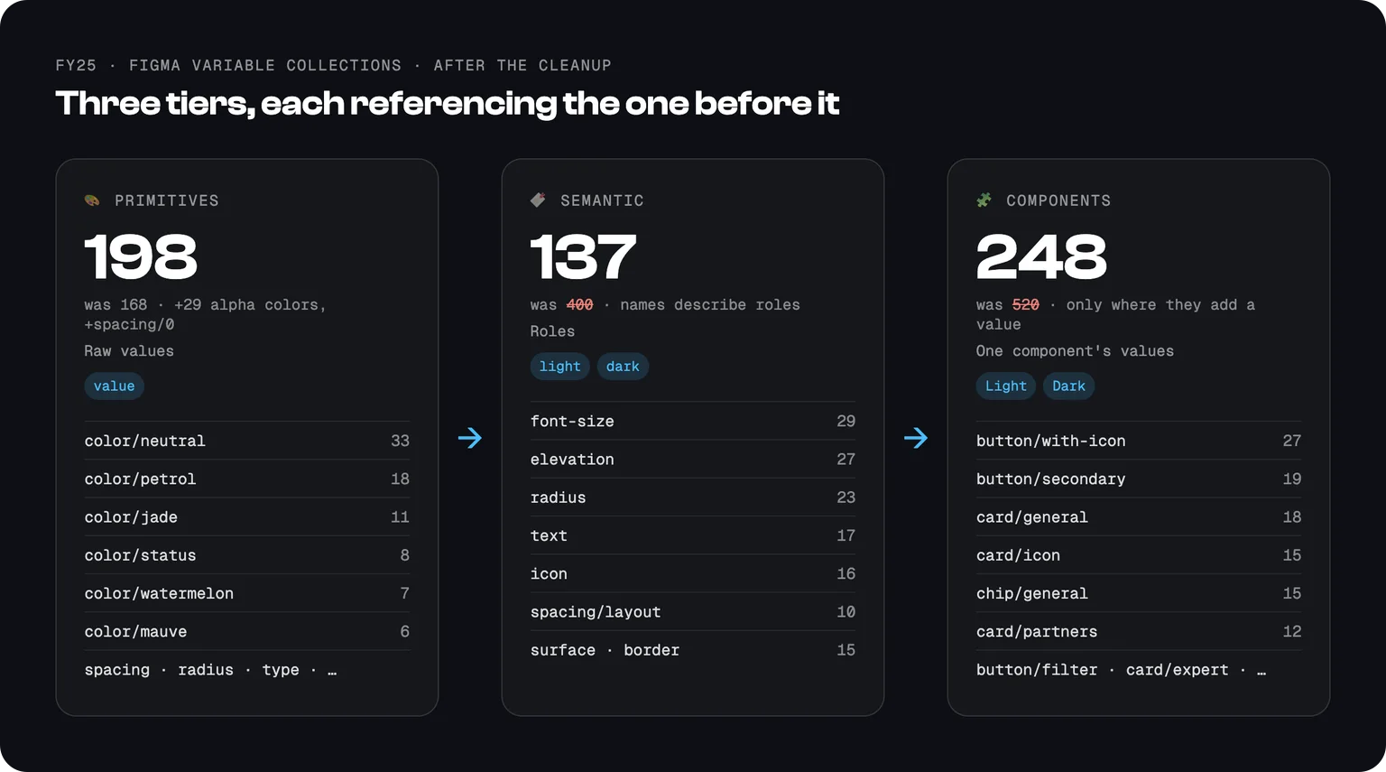
- Building a page went from 2 to 3 days to under one day. About 25 to 30 people in marketing, design and dev build with its 42 components and 198 primitive, 137 semantic and 248 component tokens. Almost every page on Epicor.com runs on FY25.
- Key decision
- Replace flat color styles and manual replacement maps with tokens in three tiers, so a brand change is made once and reaches every component.
The problem: a library that couldn't change
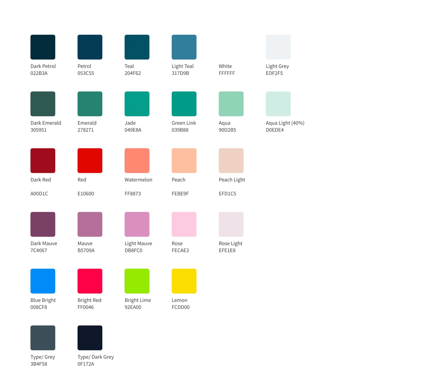
The FY23 library was built by an outside agency: about 33 color styles and no variables. An audit of the file showed why it couldn't scale:
- Colors named by hue, such as Petrol, Watermelon, Mauve and Peach Light. Names said what a color looked like, never where to use it.
- Mixed naming logic. "Green Link" and "Type/ Grey" sat next to hue names, so there was no rule a new designer could follow.
- Hex values typed as text next to each swatch. Documentation drifted silently whenever a color changed.
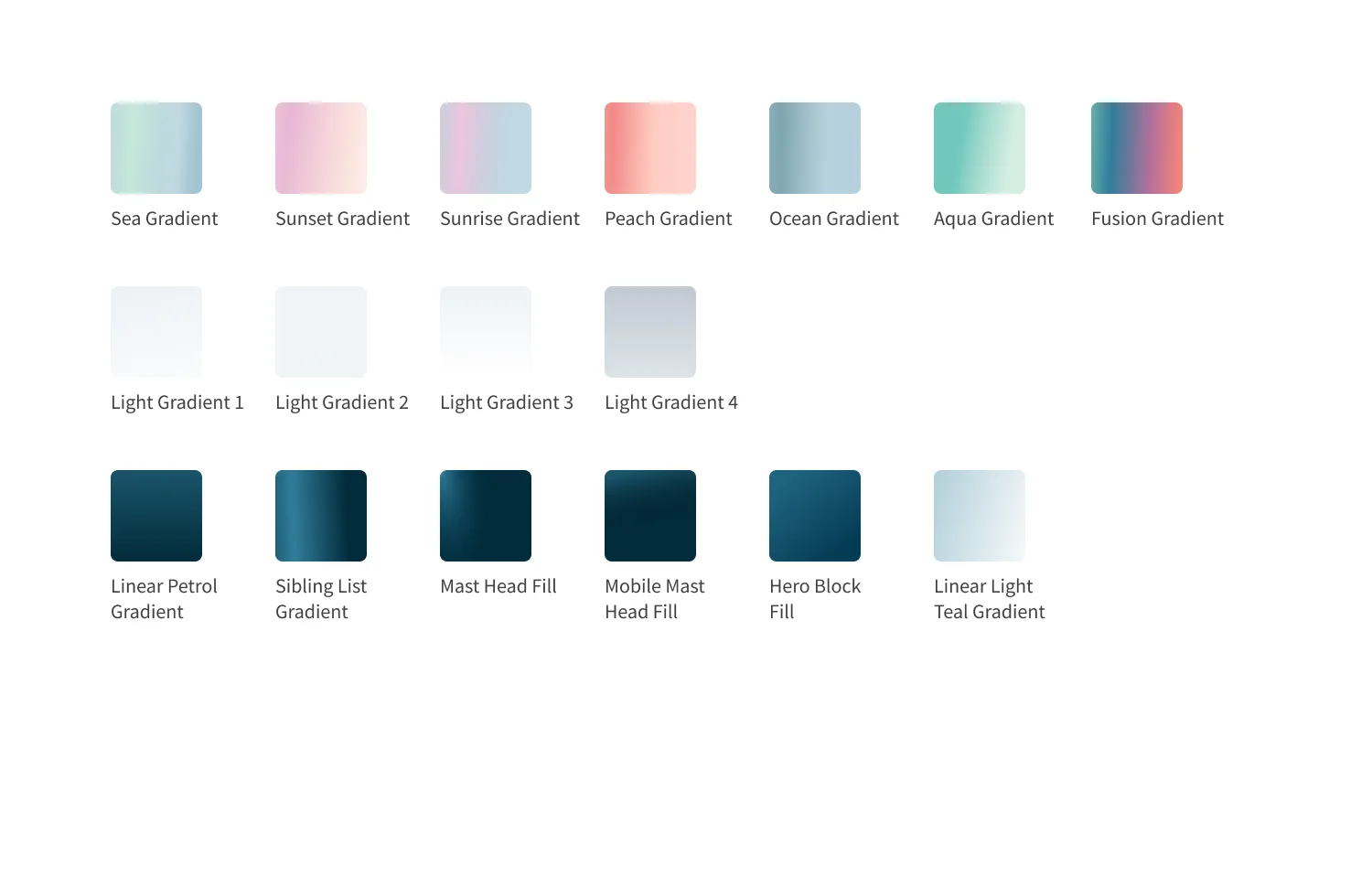
- Gradients named after placements, such as "Mast Head Fill" and "Hero Block Fill". Each style was locked to one component.
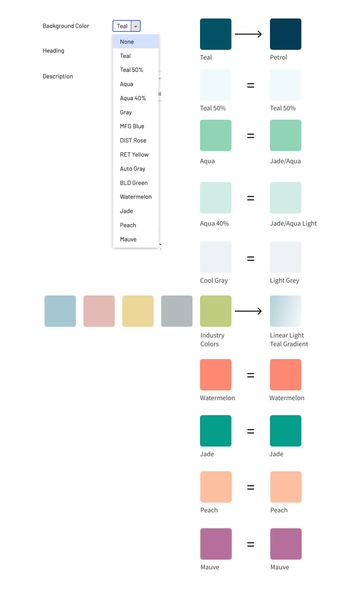
- Pages of color replacement maps pairing old values with new ones ("Teal = Petrol"). Every brand change was made by hand, page by page.
- Button variants duplicated by hand for light and dark backgrounds, with "Disabled" and "Inactive" naming the same state.
Without aliases, the system had no single place to make a change.
Architecture: three tiers
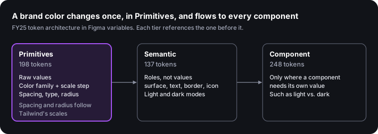
Primitives hold raw values, semantic tokens name roles in light and dark modes, and component tokens exist only where a component needs its own value. Each tier references the one before it, which replaces the FY23 replacement maps.
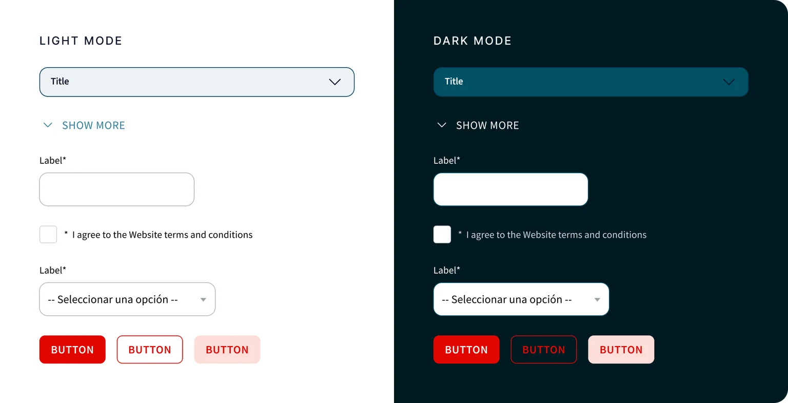
The same components, switching between light and dark modes through the semantic and component tokens:
Diagnosis and cleanup: semantic tokens that weren't semantic
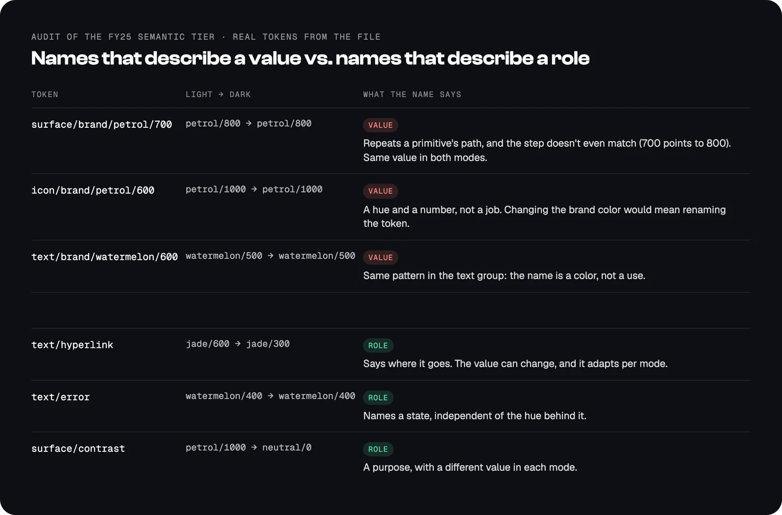
Auditing our own system, I found that many semantic tokens only repeated a primitive's path. Tokens under surface/brand/* named a color family and scale step, so switching the brand color would still mean renaming them. The text/* group got it right: each token named a job.
The rule I set: a semantic name describes a role, context or state, never a hue or a scale number. A primitive answers "what is this value?" A semantic token answers "where does it go?"
The cleanup. I applied the rule to the whole file:
- 263 semantic tokens deleted, from 400 to 137.
- 272 component tokens removed, from 520 to 248. They only forwarded a primitive's value, so layers now use the primitive or the semantic role directly.
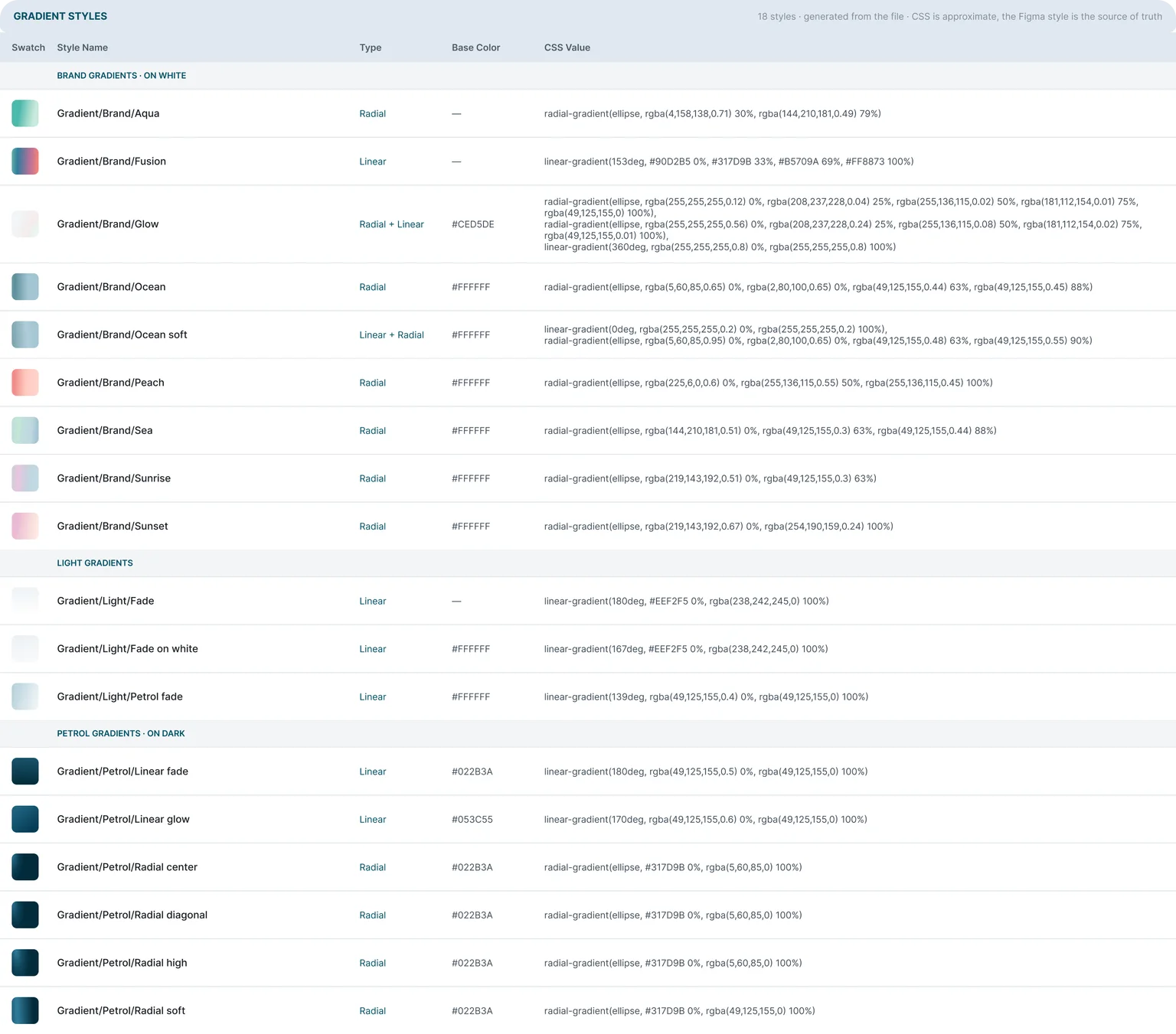
- Gradients moved from variables to styles. A variable holds one color, so each gradient had been split into three to six loose variables. 18 color styles now hold each gradient whole, direction included.
- 29 alpha primitives, such as
color/neutral/0/alpha-20, replaced transparent colors typed by hand. - No more dependency on the old library for color, radius and spacing. Those values now come from FY25 primitives.
I ran the migration with Claude through the Figma MCP: scripts that re-pointed about 19,000 layer bindings, main components first and instance overrides after, without changing how anything looks.
Brand guide drift. The same audit found values in Epicor's brand guidelines that no longer matched the Figma primitives. With the semantic layer clean, the next step is to reconcile the brand guide against it.
Components: rebuilt from production
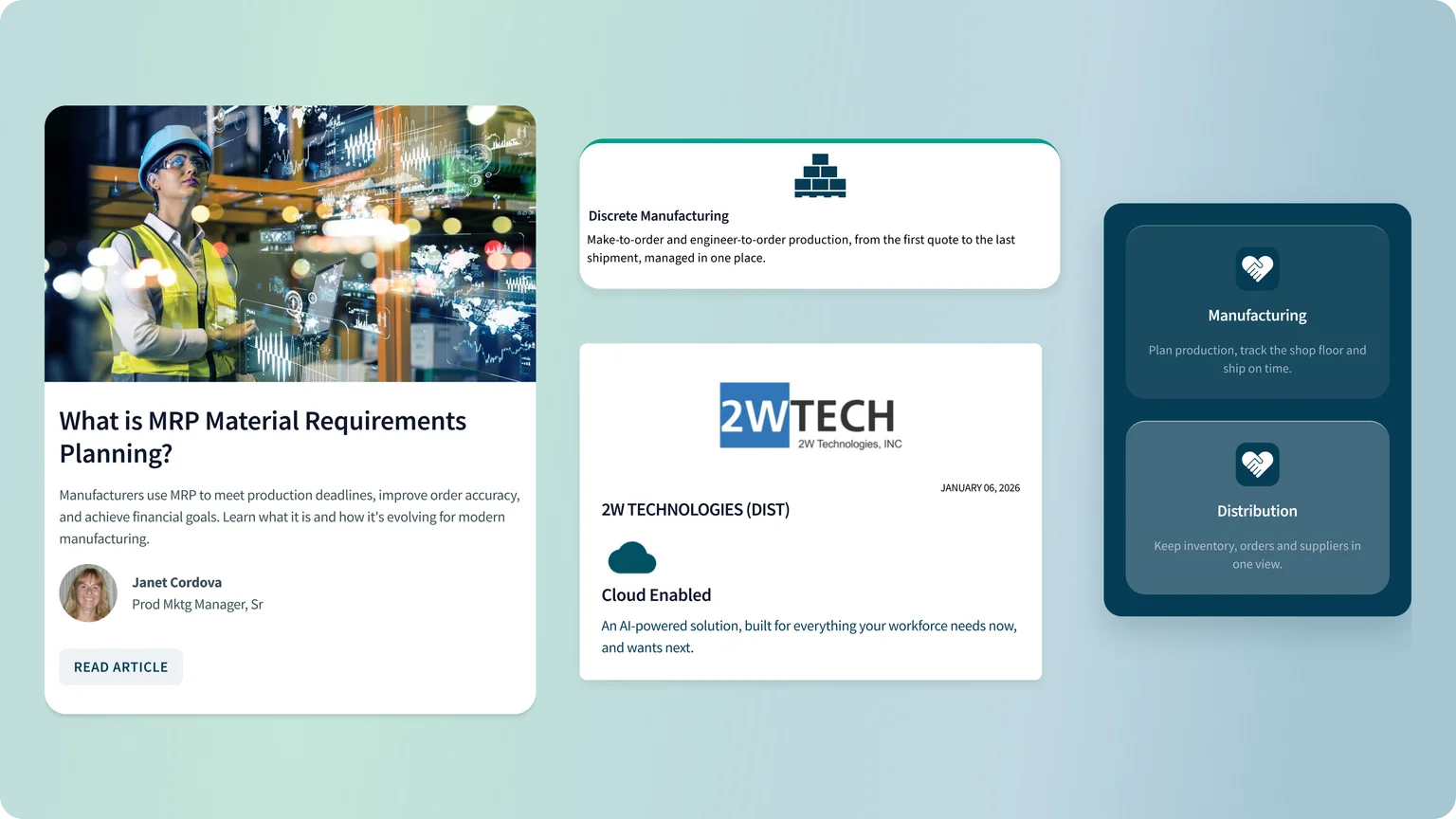
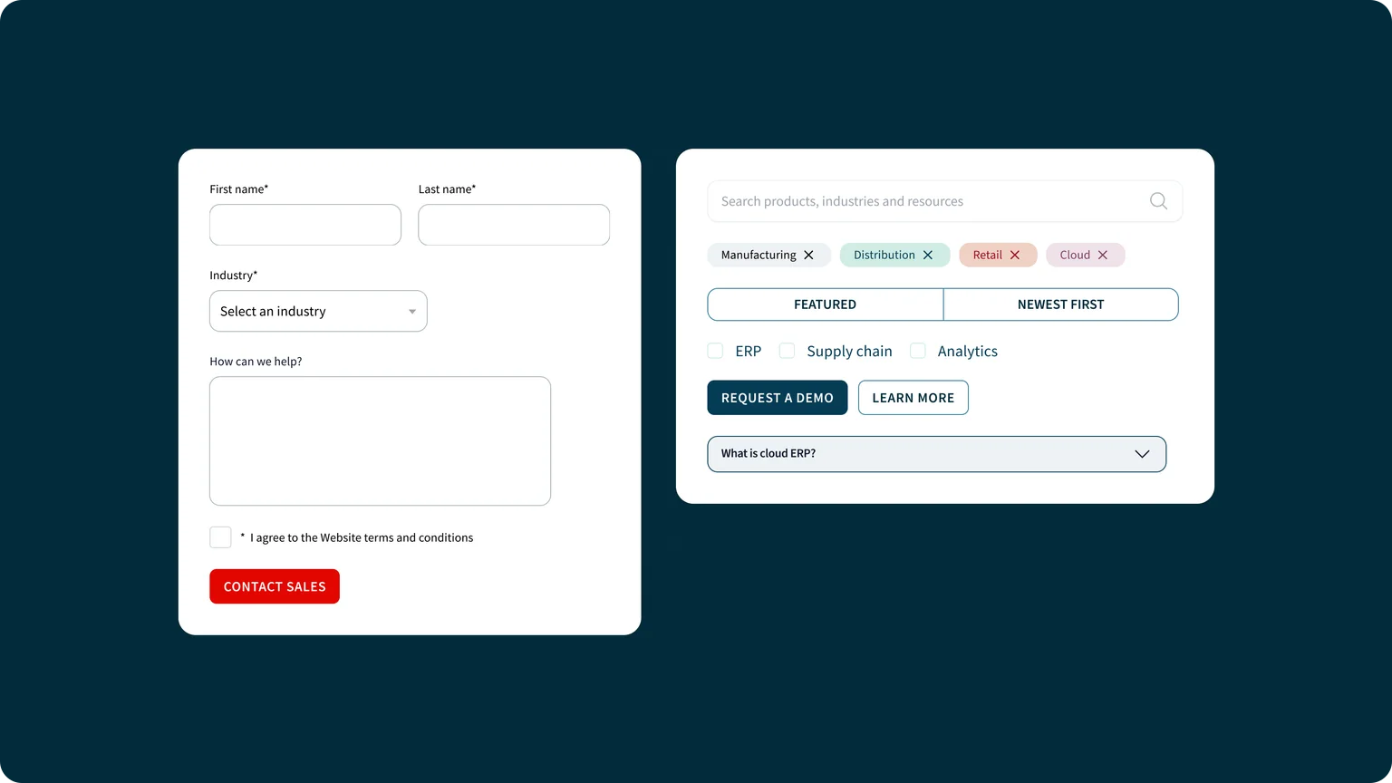
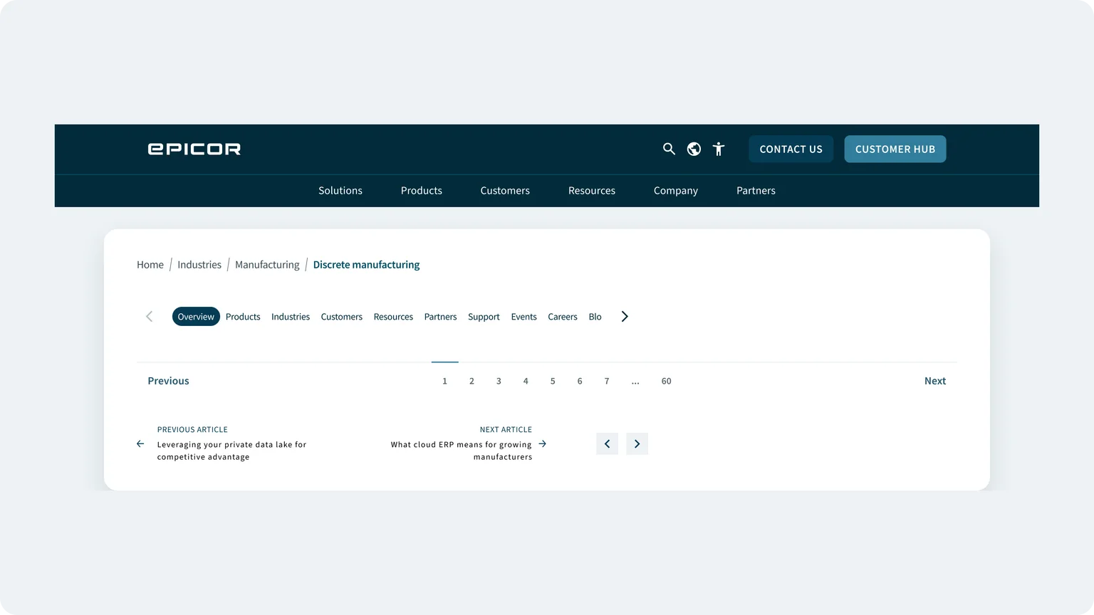
We didn't start from a blank page. My teammate mapped every component live on Epicor.com, so we knew what the system had to cover. I rebuilt them in Figma on the tokens, with shared property names and documentation for each one: accordions, inputs, dropdowns, chips, cards, navigation, buttons and more, with 1,124 variants across 97 component sets.
- Values are tokens, not typed numbers. About 95% of the 8,095 solid fills and strokes in the components are bound to variables or styles. 22 components, including Accordion, Checkbox, Chip, Dropdown, Text Input and Text Area, are at 100%.
- A small property vocabulary. Most variants are set by the same few properties, Color, Status and Breakpoint, so a new component works like the ones you already know.
- Breakpoints as variants. Some components carry a variant per breakpoint, so designers with less experience can build pages from templates without making layout decisions.
One component, end to end: the chip
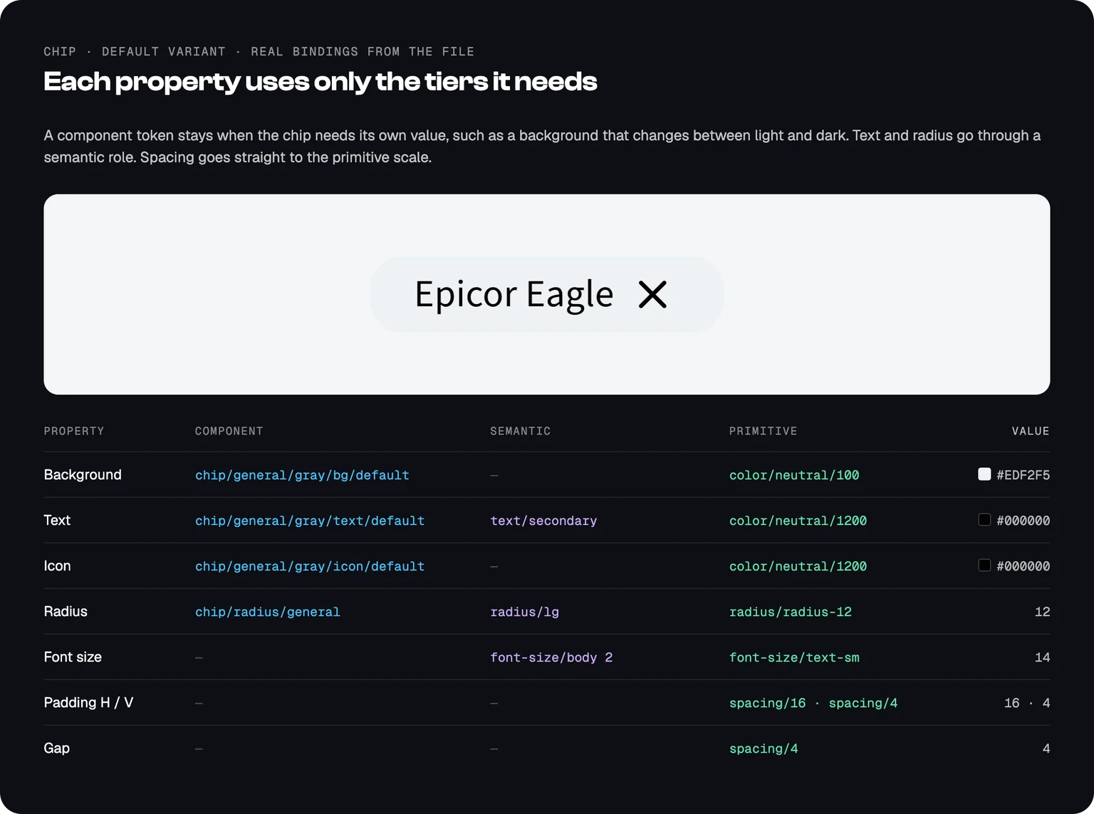
Every property of the chip is a token, but each uses only the tiers it needs.
How it changed the work
About 25 to 30 people in marketing, design and dev build Epicor.com pages in the CMS with the system.
- Before: stakeholders sent the content and the page was built straight away, with no mockup. They often disagreed with the result and asked for many changes, so a page took 2 to 3 days.
- After: marketing assembles a high-fidelity mockup from FY25 components and sends it to the stakeholder before anything is built. The review happens on real parts, so pages bounce back less, and a page now takes under one day.
A proposal: Button V2
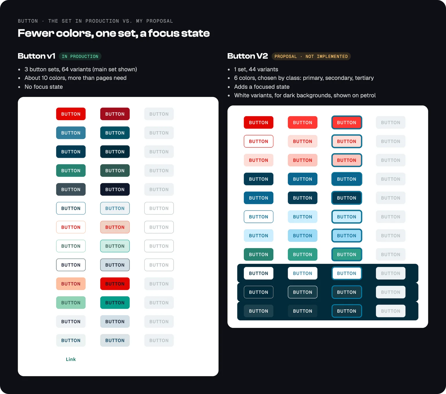
The button in production spans 3 sets and 64 variants, with about 10 colors. In my view, pages don't need that many. On my own, I built a V2: one set, 6 colors chosen by class (primary, secondary, tertiary), and a focused state that v1 doesn't have.
V2 isn't implemented, and it's still in progress: its colors aren't fully bound to tokens yet, and some property values need cleanup before it could replace v1.
Documentation and AI tooling
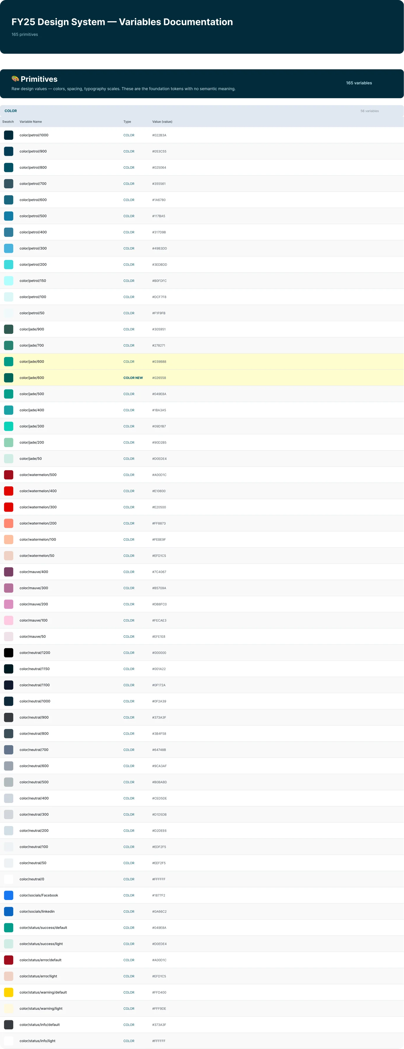
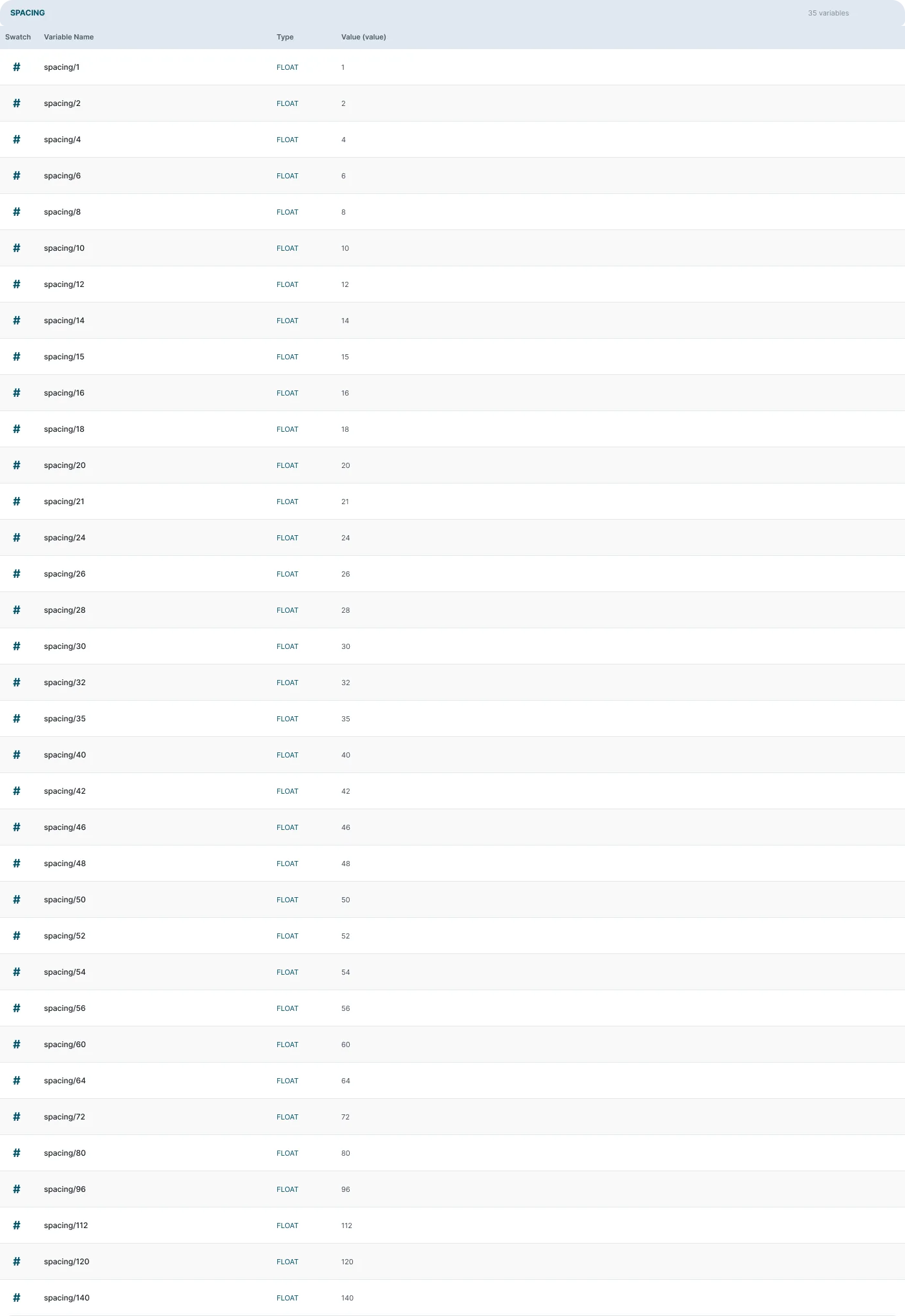
- Documentation generated from the system. Using Figma MCP with Claude, I generated documentation frames for color, gradients, breakpoints and typography directly from the variables. Unlike the FY23 hex labels, the docs can be regenerated whenever a value changes.
- Usage guidelines for the AI workflow. I led a pilot of Figma MCP + Claude and wrote the guidelines for using it.
- One home for the docs. I decided to host brand guidelines, live Figma component embeds and tokens on a single page inside the existing CMS, instead of maintaining a separate site.
Outcome and adoption
Almost every page on Epicor.com runs on FY25. The exceptions are custom pages such as the Insights event sites. Typography, type sizes, border radius and padding carried through to production. Color did not: the live site uses different values from the Figma tokens.
What I'd do differently: the design-to-code handoff
The tokens stopped at Figma. An external agency migrated Epicor's site to a new version of Optimizely and built it with Tailwind under its own naming, so our token names never reached the code. Spacing and radius, which already followed Tailwind's scales, came through intact. The brand colors, which needed custom names, did not.
So I built the handoff I'd give the next agency, from the real FY25 file:
- Export. The three variable collections come out of Figma as files, with their light and dark values and their aliases.
- Build. A script with no dependencies turns them into W3C Design Tokens JSON, CSS variables for light and dark, and a Tailwind preset. Aliases stay aliases, so a primitive change still reaches every component.
- Check. The build fails if an alias points nowhere or two tokens collide. It caught one on the first run:
radius/noneexisted as both a primitive and a semantic token. Variables now carry their tier:--ref-*,--sys-*and--comp-*.
The chip from earlier, as code:
:root {
  --comp-chip-general-gray-bg-default: var(--ref-color-neutral-100);
  --comp-chip-general-gray-text-default: var(--sys-text-secondary);
}
[data-theme="dark"] {
  --comp-chip-general-gray-bg-default: var(--ref-color-petrol-400);
}
In a browser, those resolve to the same values as in Figma: #EDF2F5 on light, #317D9B on dark. With the preset, a class like bg-surface-secondary switches with the mode on its own.
It isn't in Epicor's production code; it's what the next build would start from. See the tokens and the build script on GitHub.
This is the gap I want to close in my next role: design decisions that reach production unchanged.