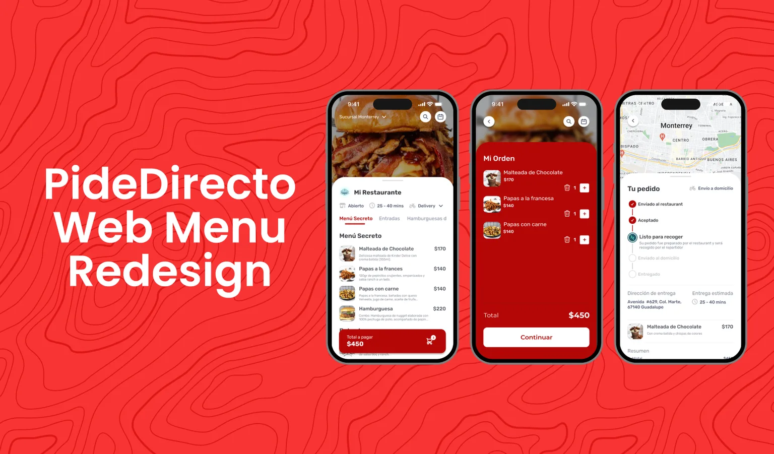
Pide Directo Web Menu
Cutting the friction between the menu and the first order. Designed and built in React.
- Role
- Led the team that redesigned and rebuilt the web menu in React. Other people on the team worked on the components.
- Outcome
- A mobile-first ordering flow, with live order status after ordering. In October 2026 it was still live, with at least 22 restaurants in Mexico and Uruguay taking orders through it.
- Key decision
- Sign-up inside checkout with only a phone number, verified by SMS, instead of email + phone + email confirmation.
The problem
Pide Directo is a web menu where restaurant customers order directly. The company also makes the restaurants' point of sale; its website lists 5,000 clients and a certification from Rappi as a Top Tech Partner. Almost 90% of customers ordered from their phones, but the menu wasn't built for mobile.
The goal was more completed orders. That meant a better experience for two groups: the customers ordering, and the restaurants selling.
The order flow as a funnel
We treated the flow from menu to confirmed order as one funnel. At every step, the question was the same: what could make someone leave here?
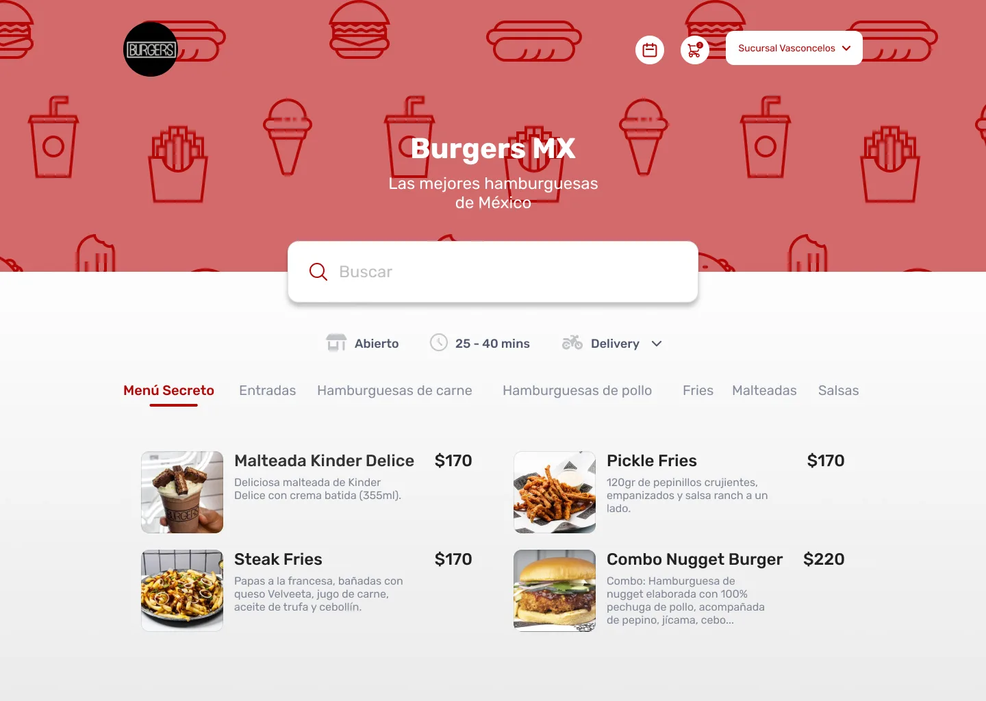
- Menu: find something to order fast, on a small screen.
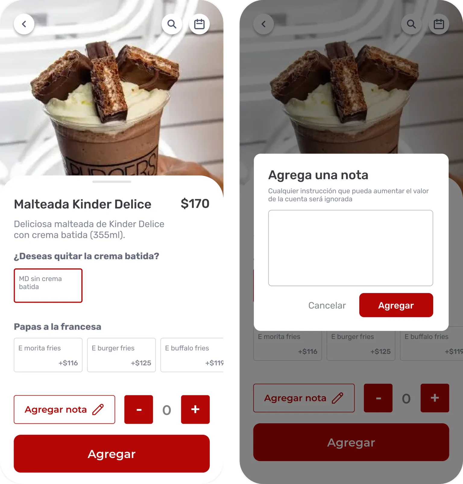
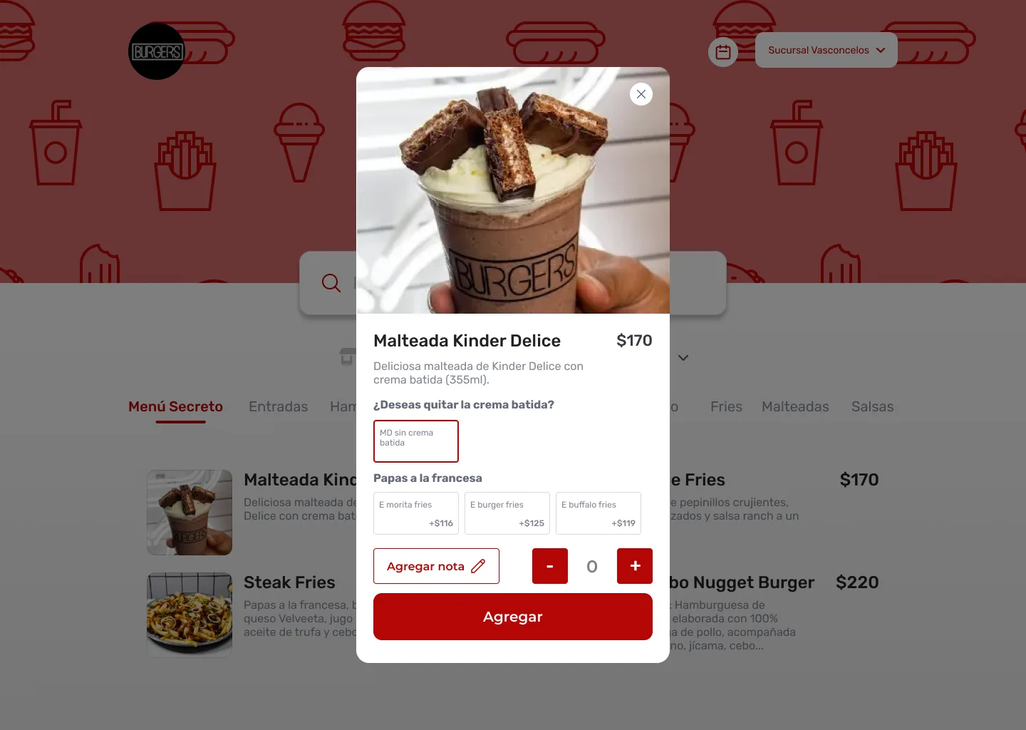
- Product: choose options without losing the way back to the menu.
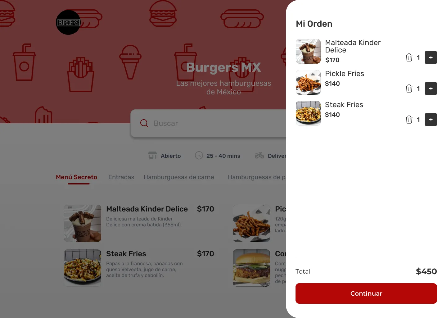
- Cart and sign-up: the step with the most friction, and the one we changed the most.
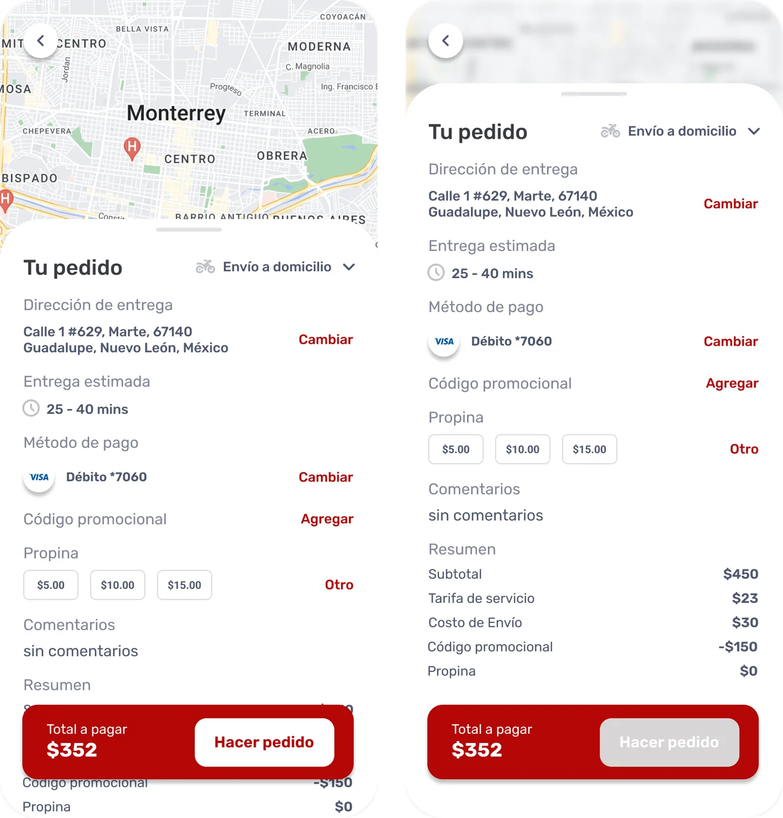
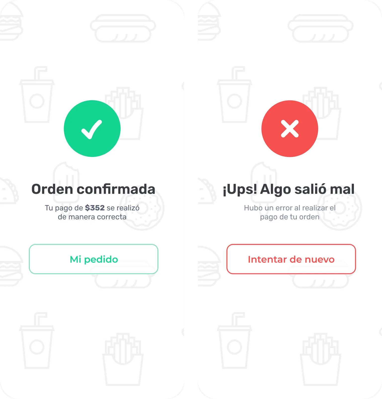
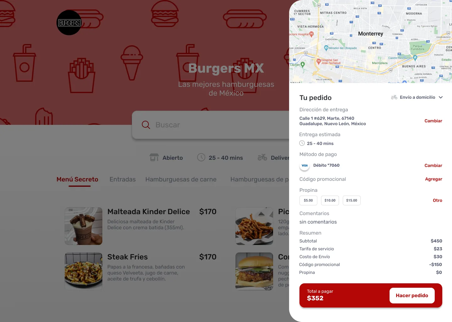
- Order details and confirmation: check everything before placing the order.
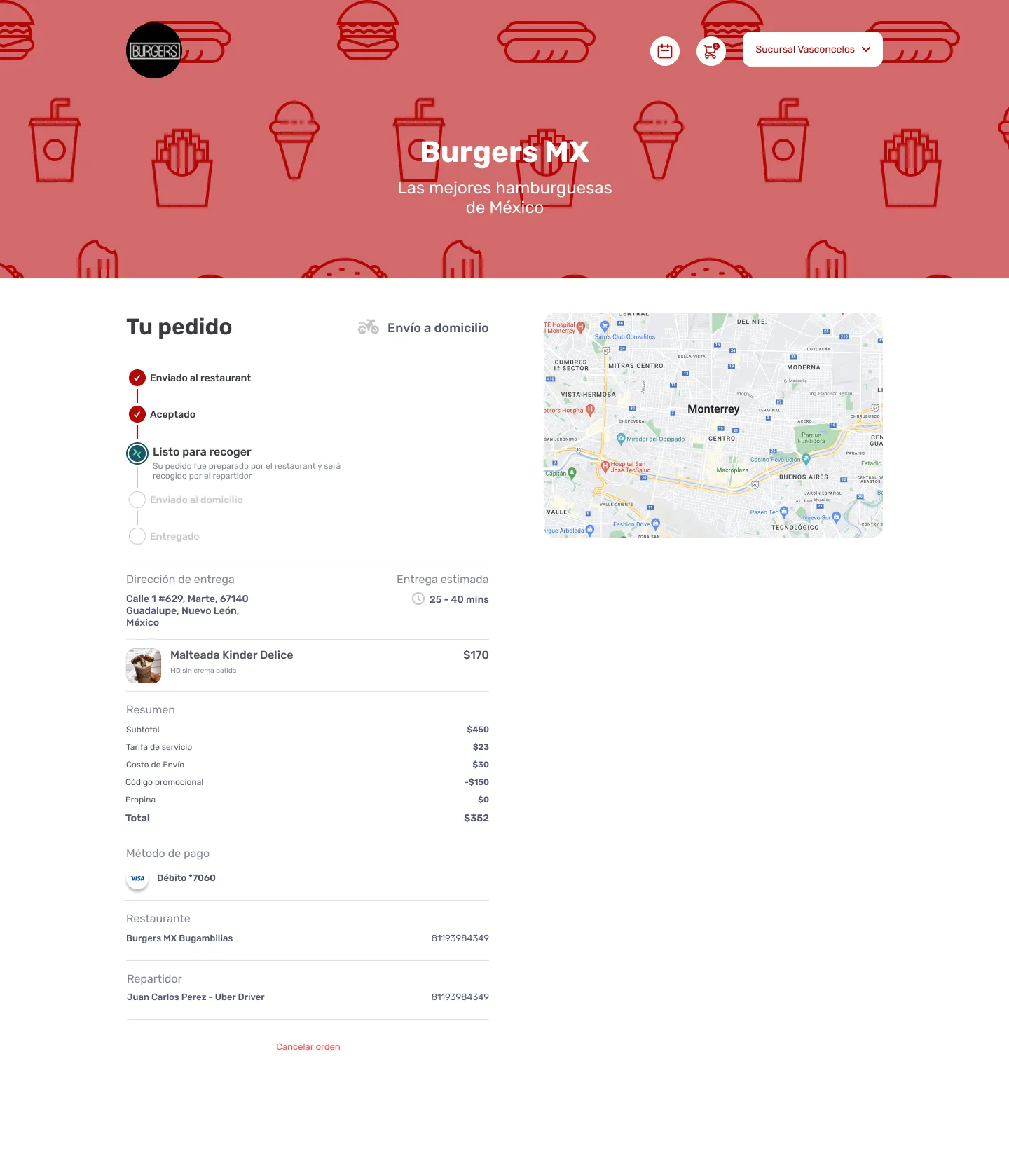
- After ordering: know where the order is.
Key decisions
Sign-up happens inside checkout
Customers sign up when they're about to order, not before. By then they already want something, so the form is a step toward their food, not a gate in front of the menu.
Phone number only, verified by SMS
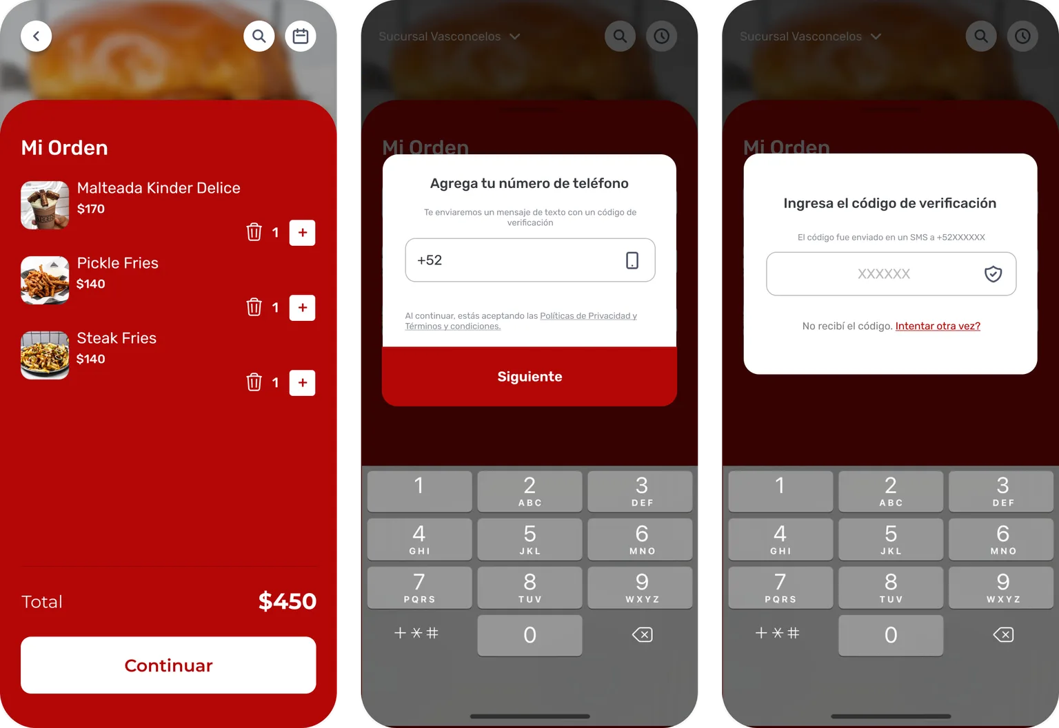
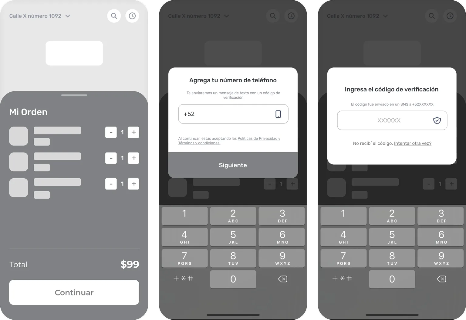
Before, signing up required both an email and a phone number, plus email confirmation. Now it only takes a phone number, verified with a code sent by SMS. The email is no longer required.
This is an activation decision. Confirming an email means leaving the app, finding the message and coming back, right when the customer is trying to order. An SMS code arrives on the phone most customers were already ordering from. Every extra step there is a chance to lose the order.
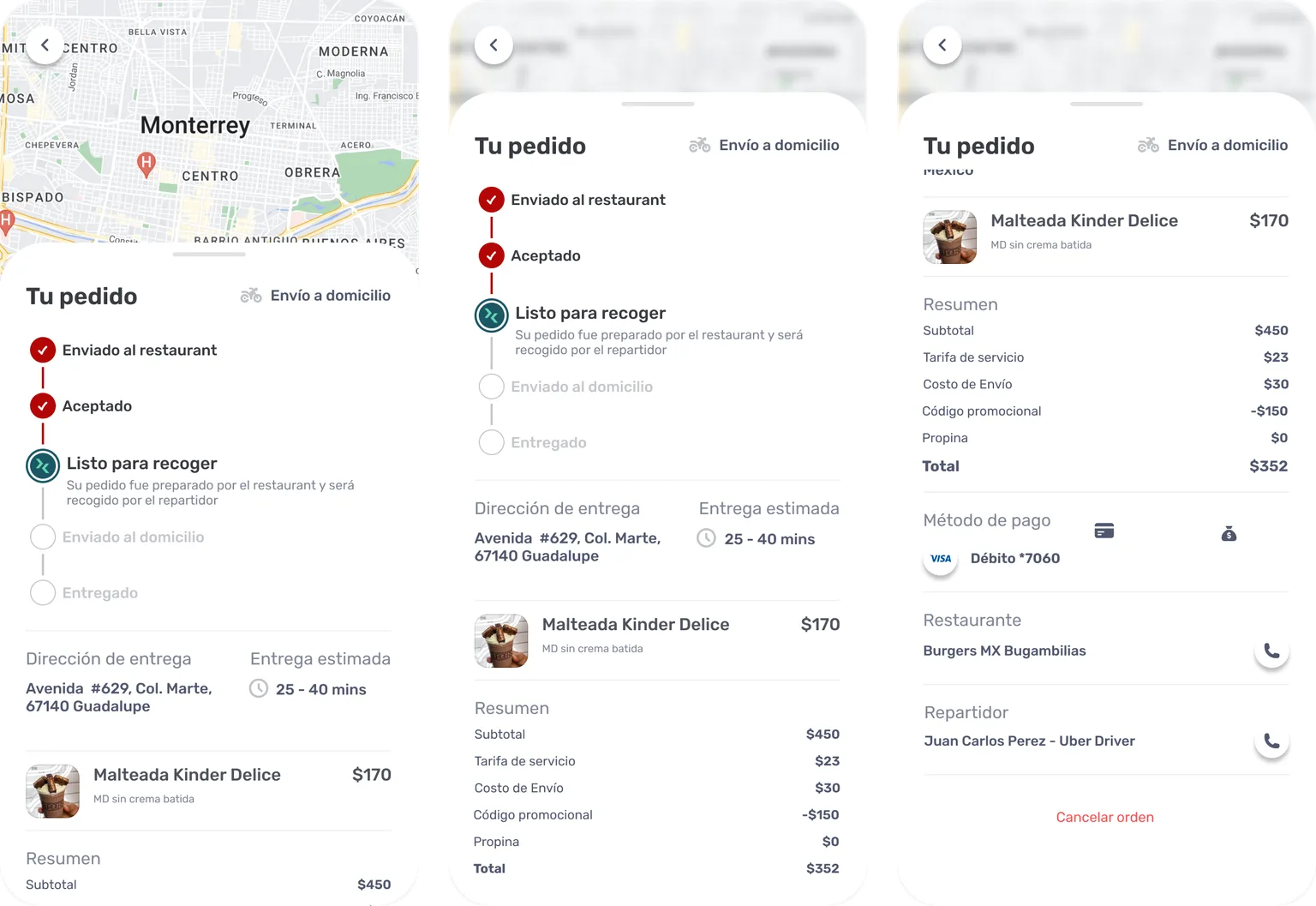
Live order status
The redesign added order states, so customers know exactly where their order is after placing it.
Mobile-first, then responsive
Every screen was designed for mobile first. Desktop views came from the mobile design, not the other way around. Reusable components kept both consistent.
The screens
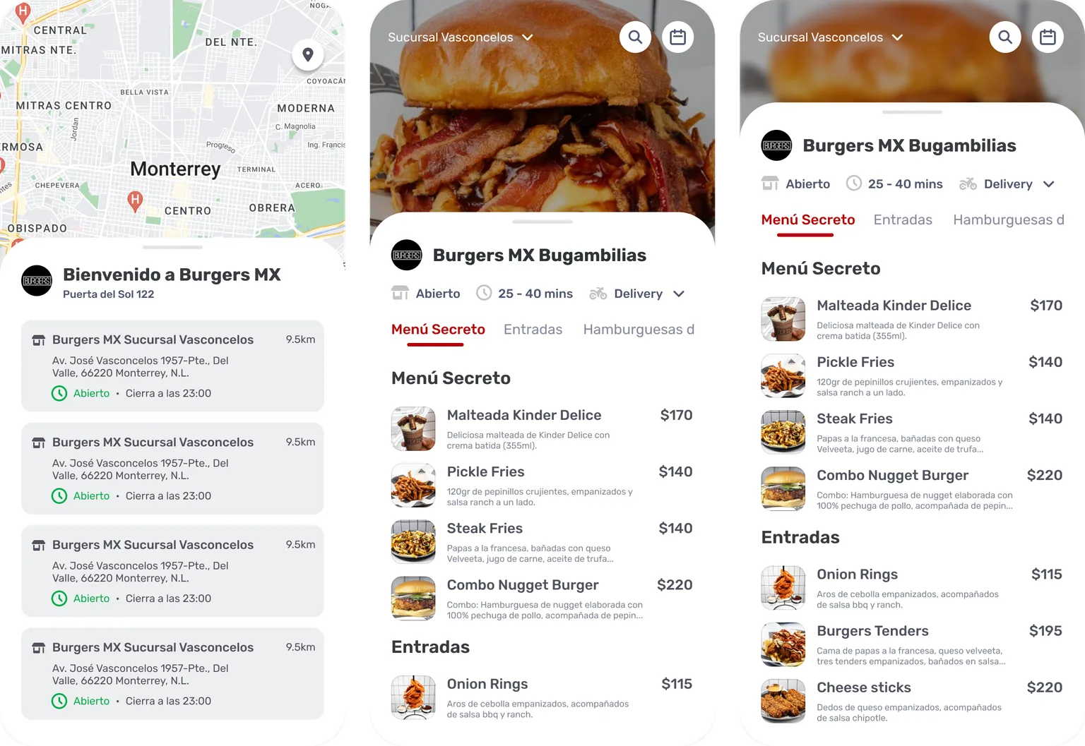
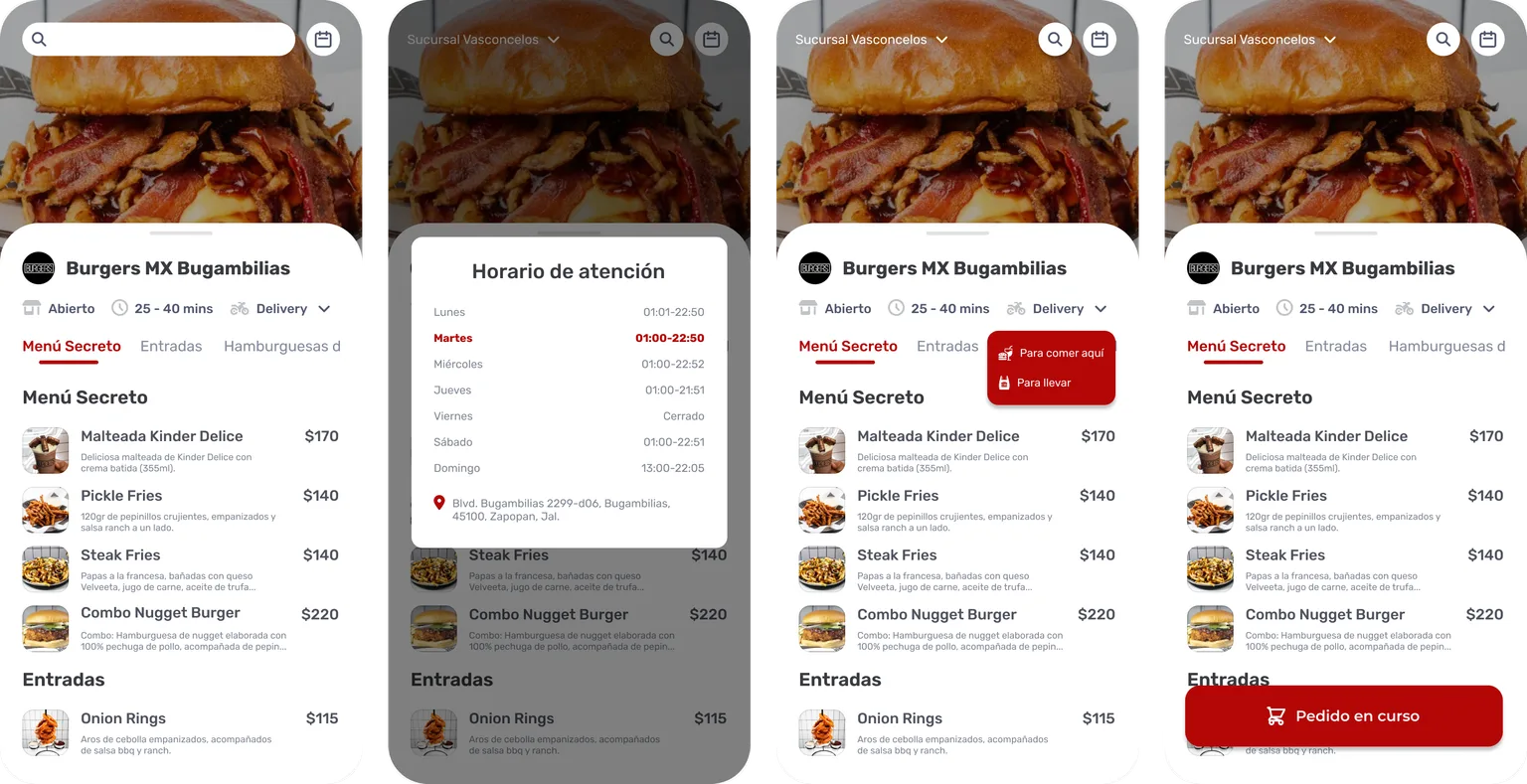
Menu
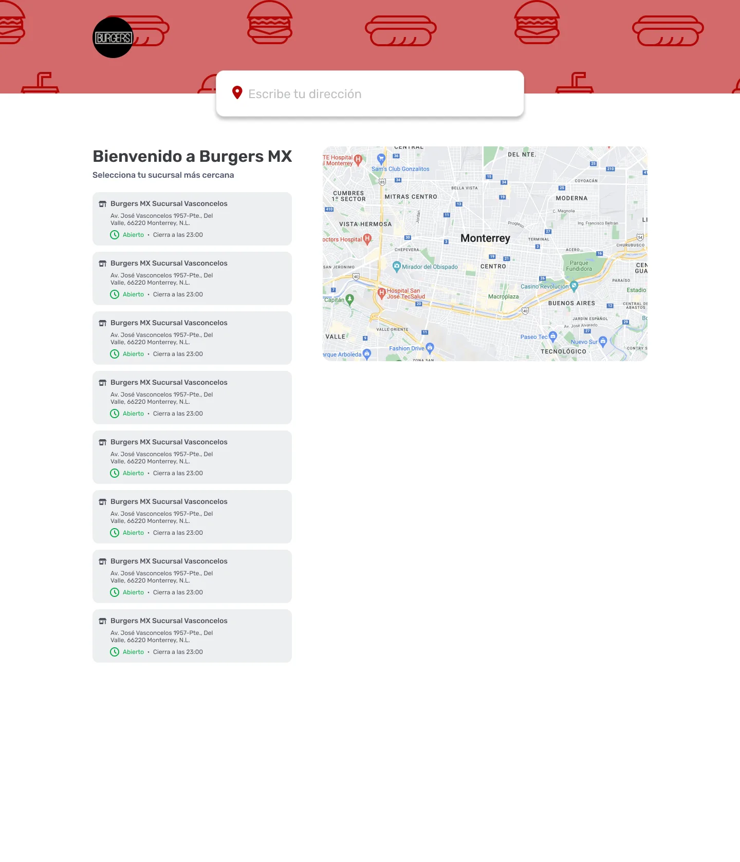
Choose a branch, then browse the menu.
Product
Cart and sign-up
The order, then sign-up with only a phone number and the SMS code.
Order details
Confirmation
Order status
Other interactions
Desktop
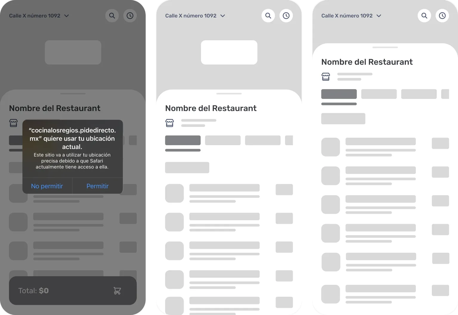
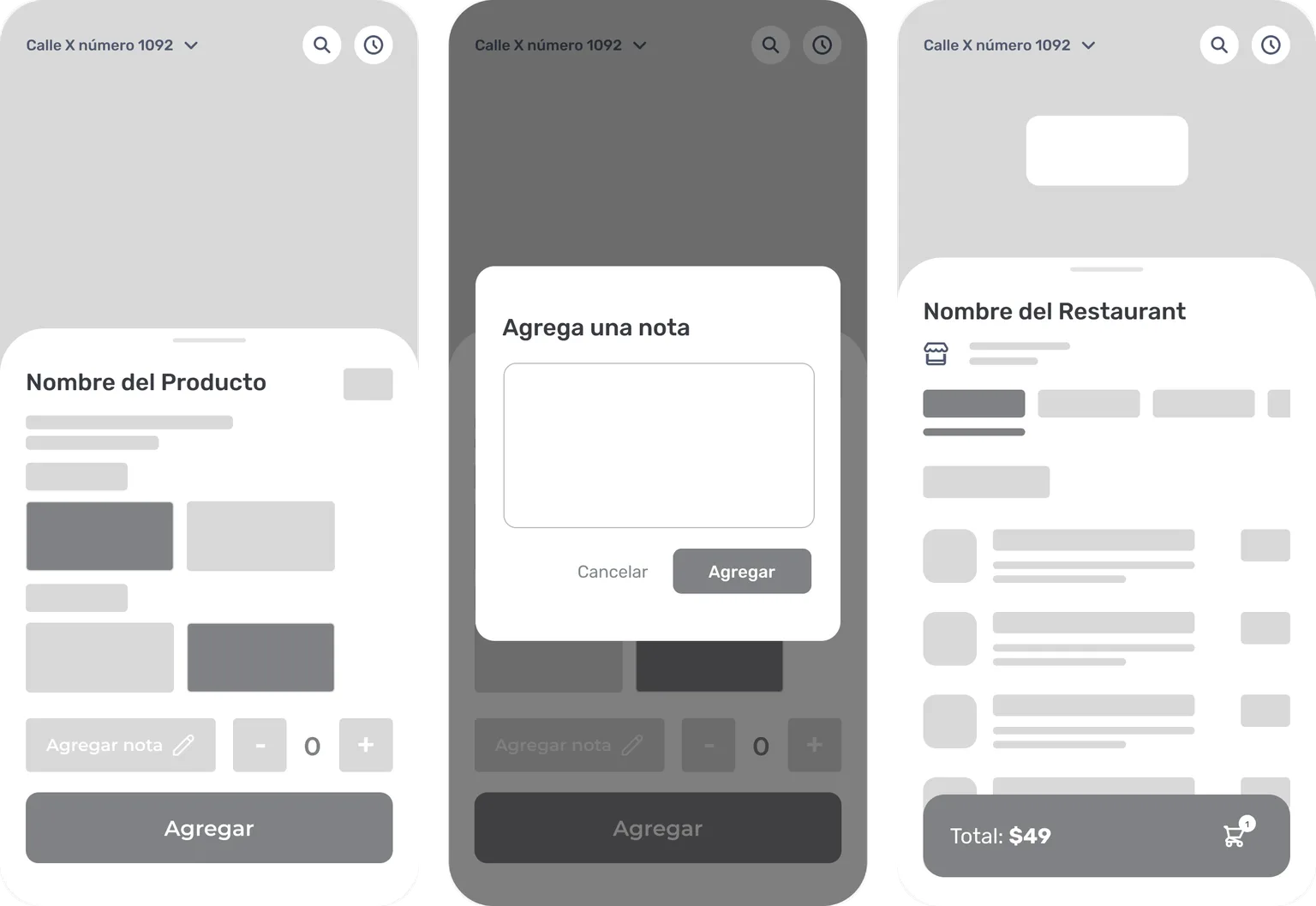
Early wireframes
Skeletons to set the visual hierarchy before any visual design.
Building it
We rebuilt the whole frontend in React; this wasn't a reskin.
Much of the backend already existed as functions in the restaurant's POS system. The new frontend was built on top of them.
We tested on different devices and shipped quick fixes after launch.
What changed
The app became visibly more functional and easier to use. In October 2026 it was still in production: at least 22 restaurants in Mexico (pidedirecto.mx) and Uruguay (pidedirecto.uy) take orders through it, from seafood and pizza places to burger joints.
Sales and checkout conversion weren't measured, so there are no numbers here.
What I'd measure
- Funnel conversion: the share of people who move from each step to the next, from opening the menu to a confirmed order. Where the biggest drop is.
- Sign-up: how many people who start signing up finish, and the time from sign-up to first order. Compared before and after switching to phone-only sign-up.
- Mobile vs. desktop: the same funnel, split by device.
- SMS verification: how many codes are sent but never entered, and how often customers ask for a new one. That's where the new sign-up can still lose people.
What I'd do next
- Test the checkout with real customers.
- Instrument the funnel above before the next change, to get a before and after.